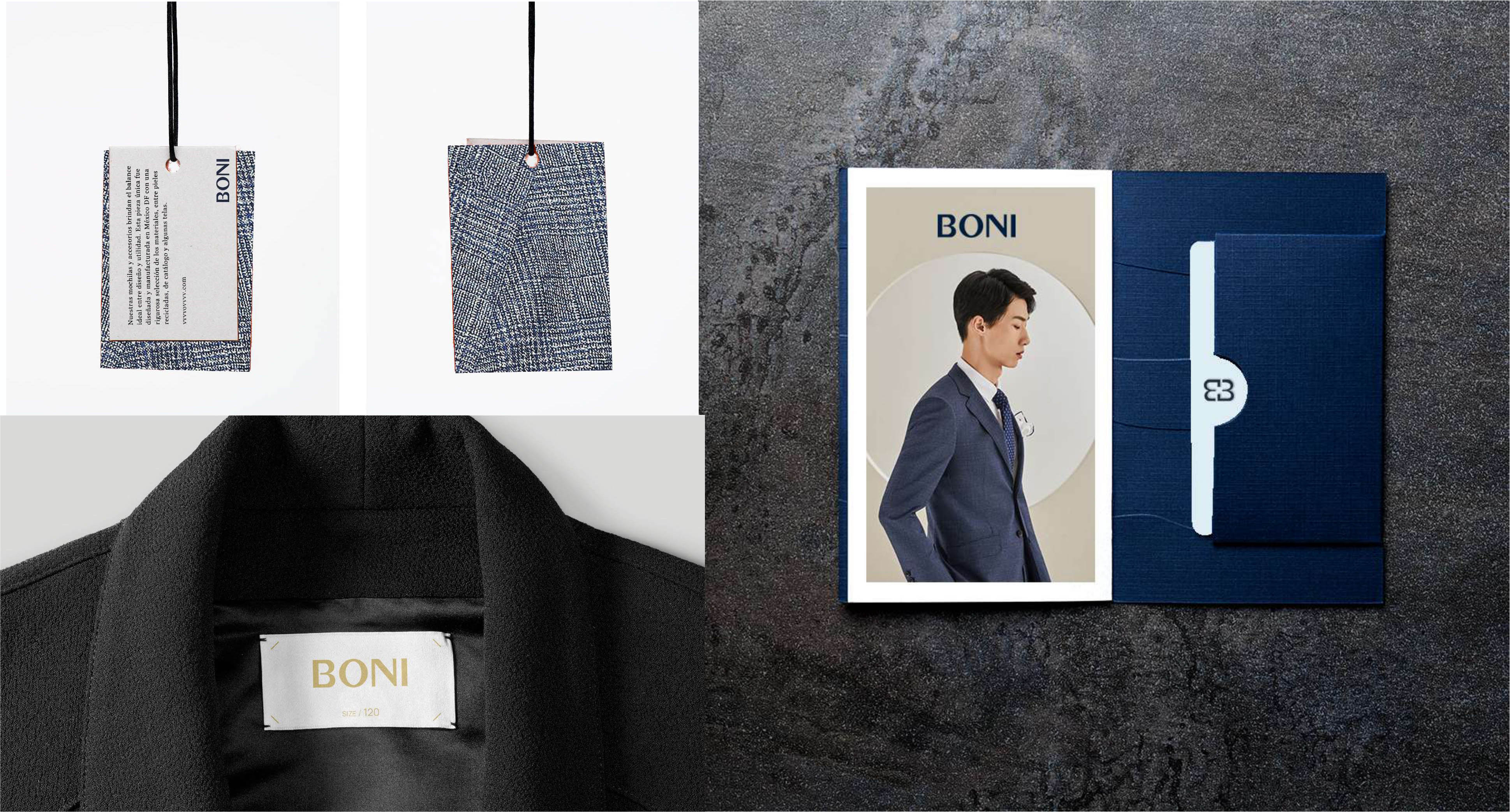
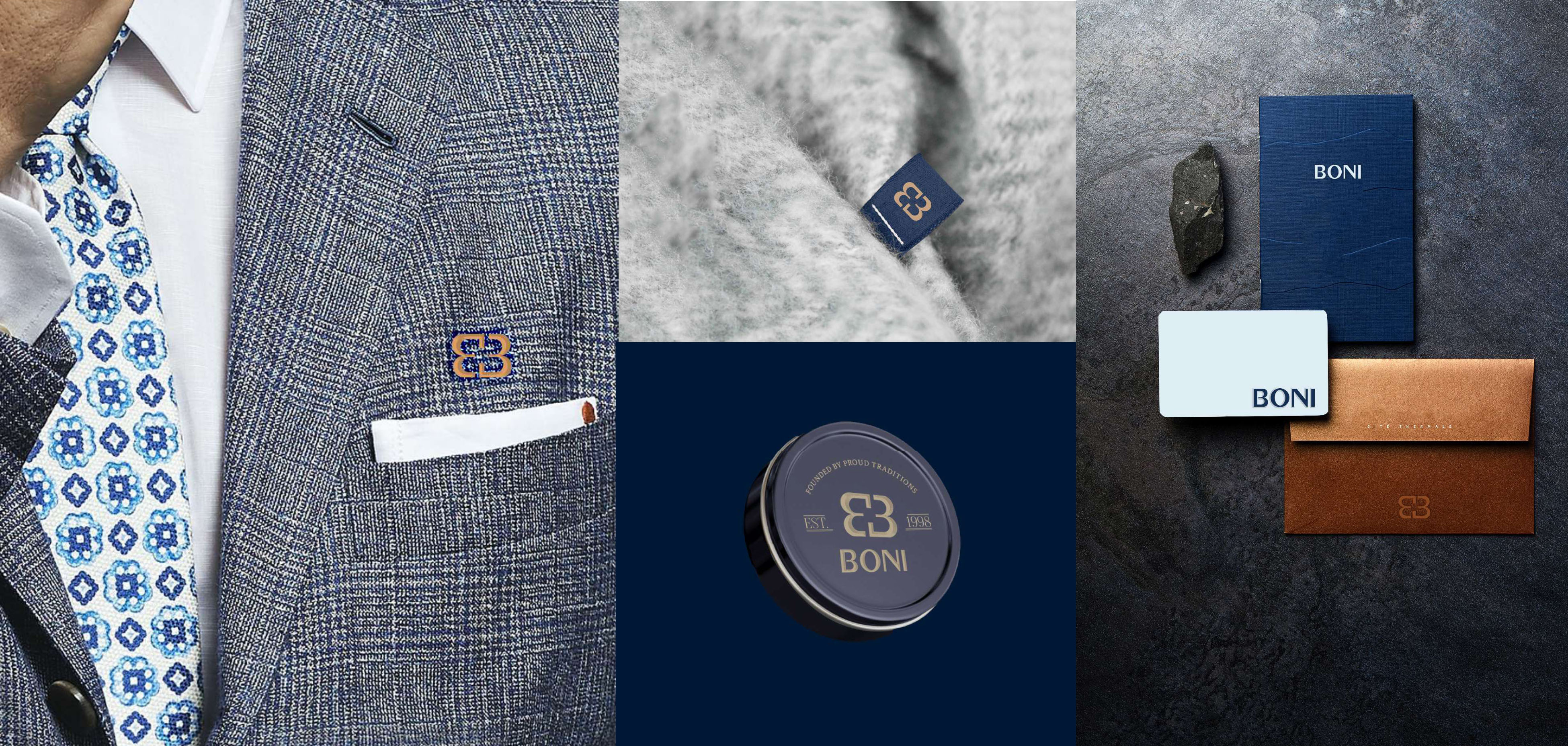
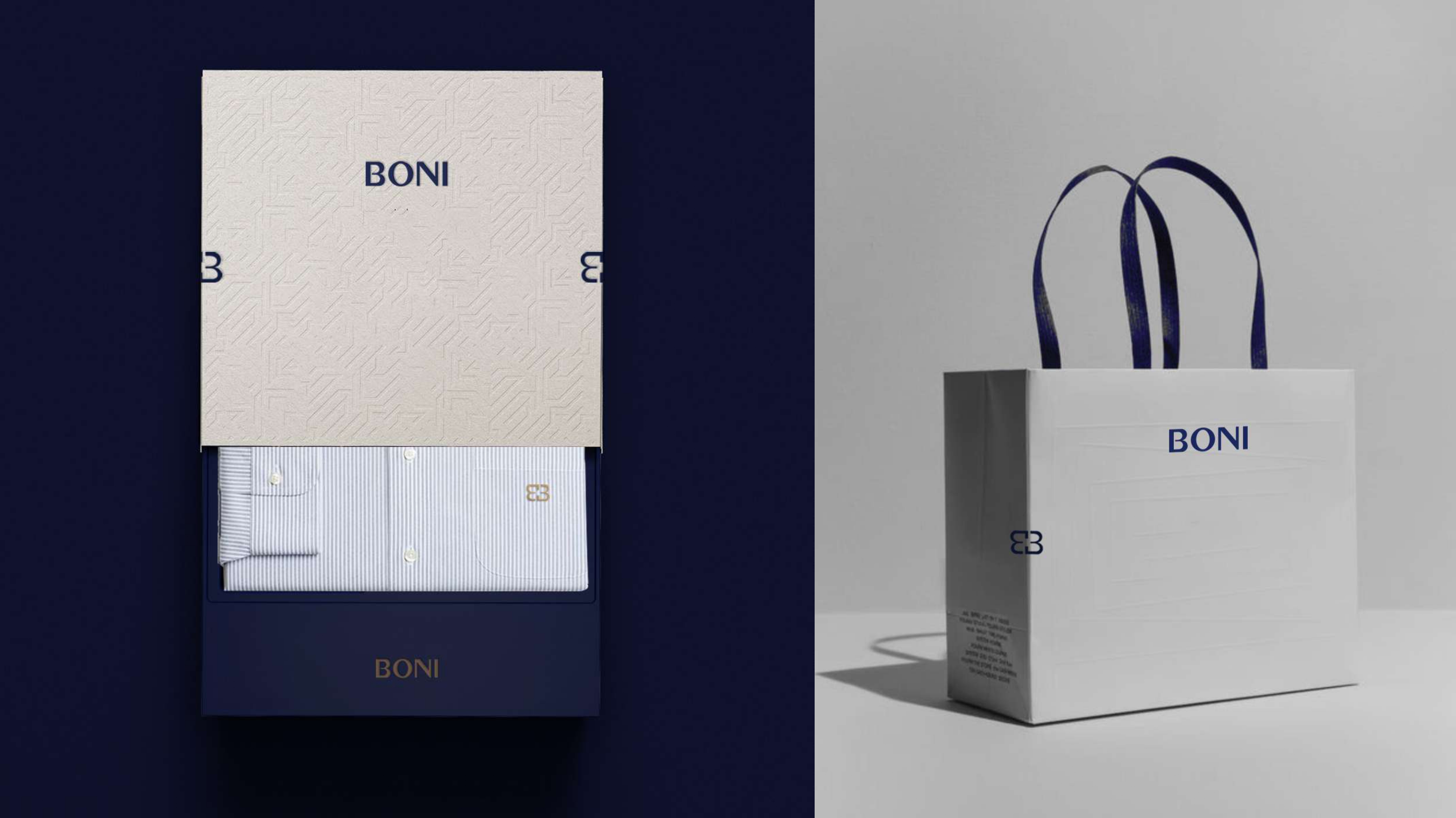
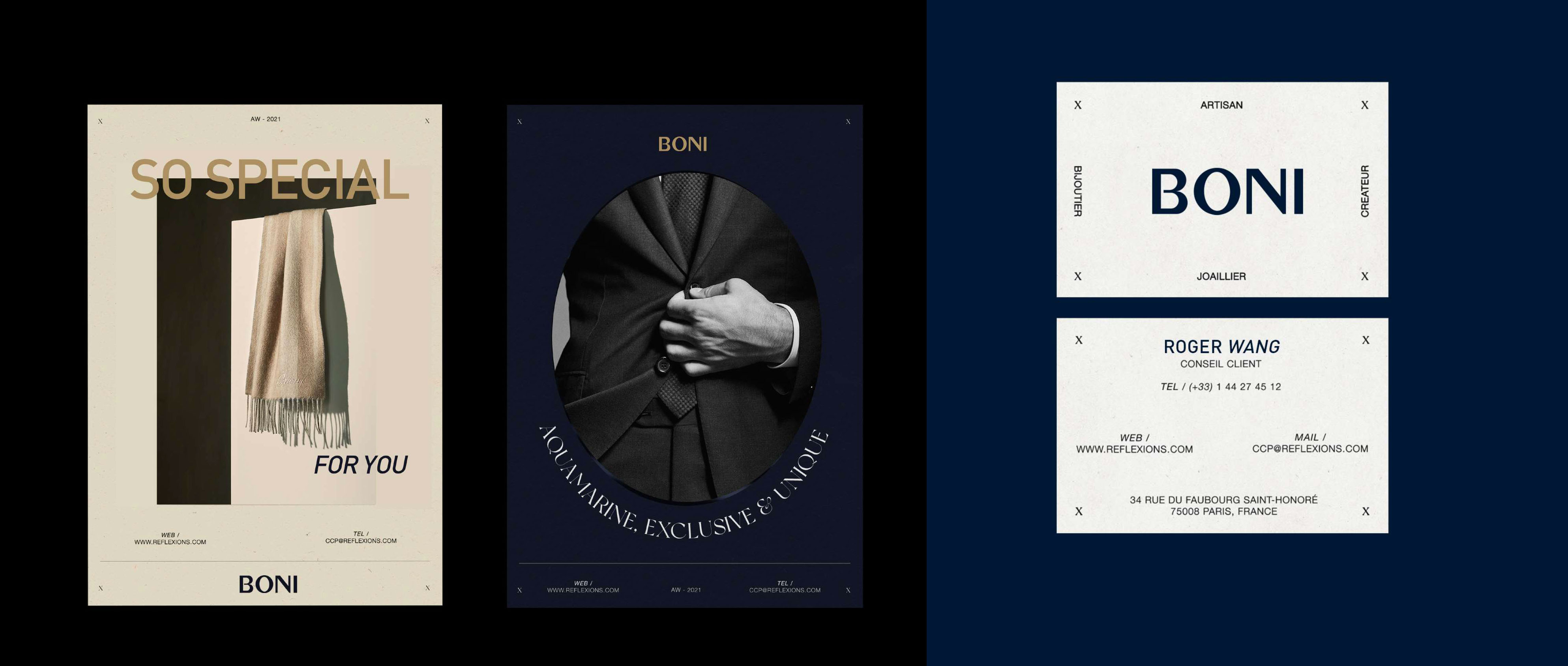
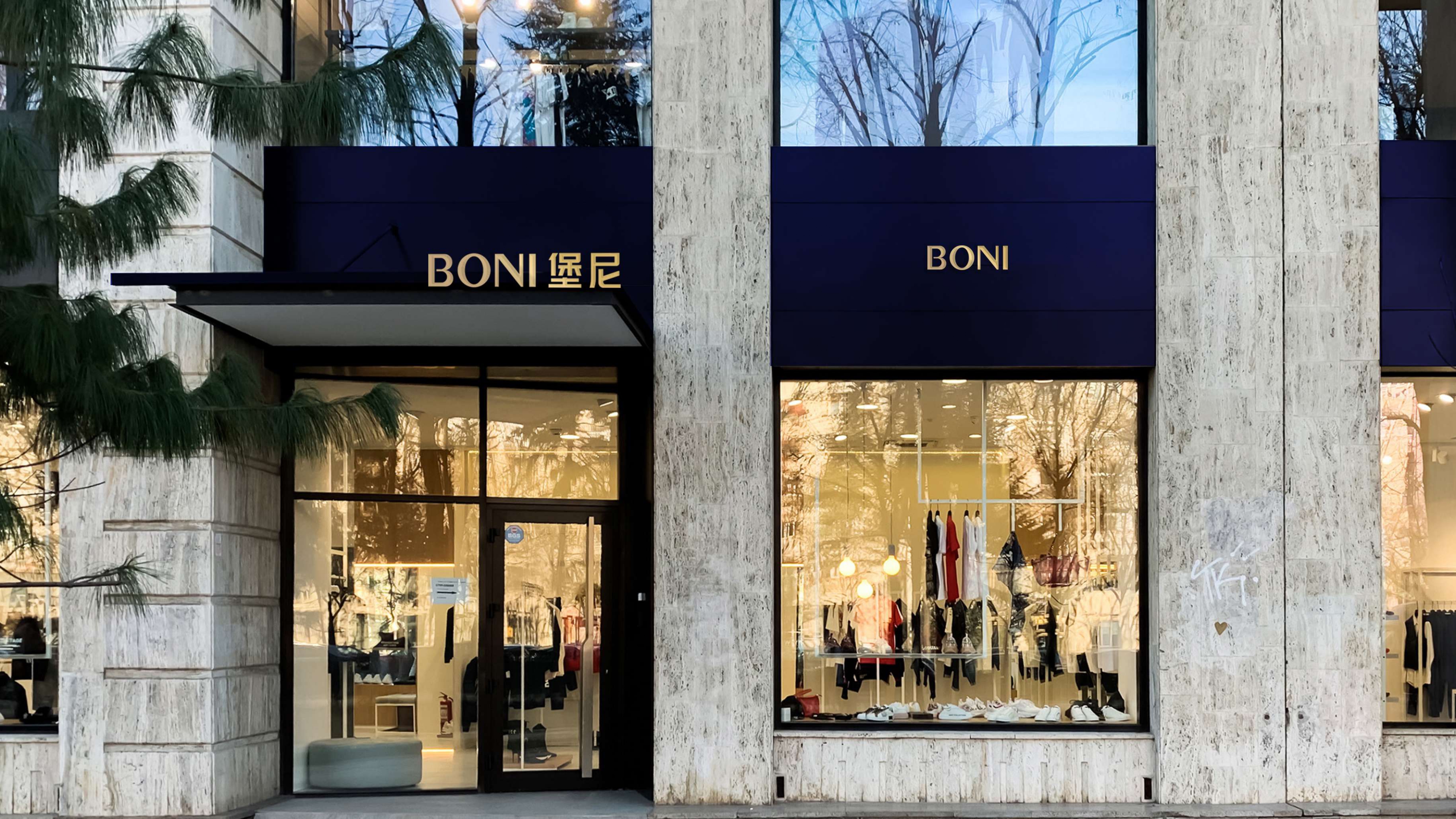
BONI Homme founded in 1995 in Shanghai, they want to upgrade their logo and all packaging. Being entrusted to make the logo look “
elegant, younger and international“. I then
decided to new logo have it flattened and
capital sans serif.
Client: Boni Homme
Creative Services:
Client: Boni Homme
Role: Creative director + Designer
Creative Services:
Brand Identity
Identity System Design
Packaging Design
Also, a brighter tone of new color gave the logo a new
vibrant look, whereas at the same time keeping it easily recognizable.
